Mobile SEO optimises your site for mobile search engine results and improves user experience. It uses many of same best practices as desktop SEO and is crucial to mobile seo for mobile rankings. People search more on mobile devices than ever.
So mobile experience must be prioritised. This includes mobile optimised site design, content and more. Optimising for mobile site SEO may change your keywords.

Importance of Mobile SEO
Over 60% of organic search visits are mobile. Desktop searches are declining as mobile searches rise.
Google reports that 56% of in store shoppers researched products on their smartphones last week.
Even if your business has a lot of foot traffic, ignoring mobile seo issues will hurt you.
Mobile First Indexing by Google
mobile first index : Google now indexes all websites mobile seo first [ mobile first index with few exceptions ].
Only the mobile version of your site counts toward rankings.
If you have separate mobile url for mobile and desktop. See Both are not same url its separate urls .
[ e.g., example.com and m.example.com ], Google will show separate urls a user friendly version in search results. separate urls performs well.
Configuring Your Website for Mobile
- Web responsive design for Mobile SEO
- Page Speed Matters for mobile SEO
- Mobile Friendly article for mobile SEO
- Optimise Images for mobile SEO
- Accelerate mobile pages for mobile SEO
Web responsive design
A responsive website design provides consistent mobile and desktop experience. google prefers responsive design only.
Responsive websites adapt their appearance and interactive elements to device and screen size used.
Modern responsive webdesign [ RWD ] adapts pages to user screen dimensions, forming foundation of these sites.
Mobile SEO : RWD uses CSS to vary font, images and menus based on device, screen size, orientation, colors and other features.
CSS optimises devices viewport and media queries, allowing web pages to adapt to viewport width and layout.
10 responsive web design best practices
Start with 10 best practices for responsive website design.
1. Watch your navigation for Mobile SEO

Site navigation changes greatly with responsive design. All of websites pages fit into right side navigation, font in bottom right corner is hard to read and graphics are clunky.
Your design must accommodate these new constraints since youre designing for smaller mobile screens.
Microsoft optimizes ads for mobile devices and implements hamburger menu for easy navigation.
Mobile SEO : Limiting your navigation to 4 to 5 core links impacts your sites mobile content strategy and information architecture. Make sure those links represent most searched places and offer deeper dives.
To make navigation easier, use icons with text, in page links, collapsible menus and dropdowns. Make your core pages easy to navigate to improve navigation.
Use inclusive language, alt text for images and widely available, easy to read fonts.
Mobile SEO : What about sidebars? Those are tricky. Desktops have lots of horizontal space, making sidebars easy to add links to.
responsive design requires designers to create simplest path without distractions. One way is to remove sidebars.
Limit site visitors scrolling. Remember that long scrolling pages make visiting navigation bar difficult. Use sticky navigation bar or back to top button instead.
For one handed use, use mobile bottom navigation.
2. Plan content organization before designing for Mobile SEO

Designing website without coherent content structure is like choosing frame before painting. To see big picture, you must organize content. Design and content work well together.
Clear content organization is important because both elements give each other meaning. Take Arobase Creatives example.
Arobase Creatives well organized infographic combines mobile content and design. Instead of bullet points or paragraphs, they used complementary colors and sans serif text.
This is great example of making content clear, attractive and easy to read. Design creativity shows they know what theyre doing.
Content organization goes beyond copying and pasting text to fit on page. Take your content as story to tell your audience. This is what Arobase Creative did.
Prioritise your messages and determine how they relate. Use responsive infographics bonus points if theyre interactive or high quality templates to simplify large amounts of information.
Your navigation bar can guide visitors through your website for a smooth and enjoyable experience.
3. Design for mobile first

More than half of global web traffic comes from mobile phones. These devices dominate market regardless of brand or OS.. mobile and desktop sites .
They Are also getting stronger and can handle responsive webdesigns. More convenient than opening your laptop, signing in and opening browser is pulling out your phone and browsing few websites.
Keep this in mind and design your website for mobile users. This means making your website mobile usability first, using maximum width of space, making navigation simple with breakpoints and uploading high resolution images with fast loading speeds.
Your mobile website doesnt need fixed width either. Adaptable CSS media queries, multiple templates and code based frameworks can make website mobile friendly mobile sites .
To make mobile optimization easy, Webflow does all work.
4. Include action buttons
Any webpage needs CTA. Waypoints like links and buttons with calls to action direct users. Without clear CTAs, it may be unclear how and where to buy or join program.
Your CTA button should stand out in color, style, size and shape. Most recognizable are circular, square and rectangular elements.
Stick to simple button shapes to avoid confusing site visitors. For touchscreen devices, make your button size finger site mobile friendly.
Allow enough space around buttons and text links to reduce misclicks.
Avoid overusing color to avoid overwhelming visitors. Choose 2 to 3 from your brands color palette for the site and use something bright to highlight your CTA.
Drop shadows, gradients and other dimension lending styling can also encourage button clicks.
5. Say only what you need

Desktops allow more text. but thats not always good. You must work on smaller screens on mobile devices.
This means writing economically so every word advances your story.
Use clear copy and typography to convey your websites purpose. Limit font combinations and use fonts that match your brand to avoid overwhelming site visitors.
6. Smaller screens make typography more important

Few people have time or patience to learn everything about your company. This makes website readability crucial.
Use typography to help visitors absorb as much information as possible quickly.
These 10 Google fonts are our picks.
Use legible font for important text like navigation labels. Larger font sizes make text easier to read on screens.
Desktop and version of your site readers should read 16px body copy. Adjust size based on fonts design [ we recommend using em, starting at 1 to 1.25em ].
Smaller screens need spacing too. Too much will make your text float and too little will pancake your words. Set line height properly. Typefaces vary.
So experiment first. 1.25 to 1.5 works well. During design, test your text on different devices to see how line height affects presentation.
When designing for mobile, remember that larger font may push important content down page. To add drama, try different font weights, all caps or all lowercase or color to distinguish content sections from other elements on the page.
7. Value negative space
Negative space or white space is empty space on website. Negative space gives screen elements breathing room.
Someone searching for simple information may be overwhelmed by full screen of loud graphics and large text and leave your content.
Using negative space in responsive design is tricky. Yes, you want minimalist content and navigation. negative space should improve website visuals, readability and user experience.
You shouldnot miss anything important. Use negative space to break up your design and highlight important content.
8. Build and test responsive prototype

Knowing how designs look on different screens is crucial. You must also understand its real world use.
To understand how site will work and feel, you will need functional prototype after static prototypes.
To ensure website functionality, test your prototype on real devices.
This will save you time and avoid snarky tweets about your site being broken on mobile. This can be simplified with visual web development platform.
9. Go fast with responsive images

Images that load quickly on all devices keep your dynamic serving website moving. This requires responsive images to speed up web page loading.
Website speed or desktop site speed is increasingly important for desktop and mobile seo, user experience and bounce rate.
People may leave slow loading site to find their information. Images visually scale on smaller devices. but they are still 3MB and slow load times to crawl in responsive design.
Workarounds like responsive images are powerful and effective.
10. Use Flexbox to power layouts

Flexbox is CSS3 layout module that makes your layout responsive across devices. Flexbox makes responsive websites without complex CSS code and attributes.
It simplifies creative layouts like split screens, sidebars and hero covers and lets you quickly create equal height modules and Z pattern feature lists.
Give parent container display setting of flex, then choose how its children distribute themselves to use flexbox. Though simple, it offers strong flexibility.
Responsive design has changed web for better
Desktop designs large spaces often led to unnecessary graphics and content that detracted from sites message.
rise of mobile devices and tablets changed dynamic serving website design and navigation.
A websites design and interaction depend on device we use. We can remove unnecessary features with responsive design to help users find what they need faster.
Page Speed Matters!
Page speed refers to time it takes to display content on page or receive first byte from web server. All page elements, including same html code , CSS, JavaScript, images, videos and multimedia, impact speed.
pagespeed is affected by everything from an elements kilobyte size to its web server speed.Desktop and mobile pagespeeds are measured separately.
Due to technology differences, desktop and mobile users device experience different things.
Page vs Site Speed
Pagespeed is different from site speed, despite appearances. maintain multiple pages in responsive site speed is average of several sample pages. pagespeed indicates how long user will wait to view page.
Why PageSpeed Matters
Pagespeed matters because faster pages are more efficient and improve user experience. Over quarter of users will click away and choose different search result if page takes longer than 3 seconds to load, according to Kissmetrics.
SEO do not want to increase bounce rate!
Mobile users expect fast loading. same survey found 73% of users visited slow loading dynamic serving responsive site. Pagespeed impacts conversions.Walmart.com observed 2% conversion increase per second of increased pagespeed.
Although less obvious, pagespeed is also important for SEO. Pagespeed became Google ranking factor in 2010.
In 2017, Google announced it would use mobile site speed to rank sites on its mobile first pages. Which separate mobile rankings.
Google is testing Accelerated Mobile Pages Project [ AMP ] to improve page loading speed on mobile devices.
The search engine recently added Page Experience to its ranking signals to emphasize user experience.
This new ranking signal combines Core Web Vitals with mobile friendliness and safe browsing to create Page Experience search signals.
Page Experience signals evaluate web pages based on real world user experience. In summary, they add content experience factors to Googles recent on page criteria. Naturally, pagespeed is major factor.
Pagespeed Metrics
It is important to understand how page speed is measured to fix website performance issues.Several metrics affect pagespeed. Check out Core Web Vitals:
- The Largest Contentful Paint [ LCP ] affects page load time. It indicates that pages main content is loaded properly.
- The First Input Delay [ FIP ] is the time between a users first interaction with your site and the browsers response.
- Cumulative Layout Shift [ CLS ]: Shows unexpected layout shifts or page visual stability. Users may click the wrong button if the page shifts.
Page Slowdown Factors & Page Speed Analysis
These convincing statistics make it important to load your site quickly. Consider several ways your site may slow down.
First, responsive or high DPI image sites can load heavy image pages slowly. Optimizing images and using CDN to render them closer to users can make your website lighter.
Too many large downloads on your website cause another issue. page will load slower with too many JavaScript scripts. JScript compression or minimization reduces download size.
Does your site cache pages using servers? For rarely updated web pages, this can lower your TTFB by storing copies for week to year.
Unused CSS, JS and other scripts in HTML increase page load time. Early or late script rendering is another major issue.
Webmasters often design pages to be consumed after loading all content. Most users only need to see above the fold content to enjoy page.
This allows browser to load all below the fold elements without waiting for user.
Without pagespeed analysis, you may not know how users interact with your website. Google Lighthouse, free, open source tool, checks page performance and accessibility.
This tool helps identify core performance issues and determine if your sites progressive apps qualify.
Mobile friendly content reigns: 10 Tips for Friendly Content

We have heard that mobile friendly websites improve user experience and mobile SEO. mobile friendliness usually means ensuring your webpages resize properly on mobile devices in desktop and mobile sites .
Mobile friendliness goes beyond device responsiveness. same goes for mobile friendly useful content.
Marketers should view mobile friendliness as holistic effort that focuses on entire customer experience on your website.
We have listed our top tips for creating mobile friendly or user friendly content that engages and converts customers to boost your efforts.
1. Write Effective Introductions

Mobile phones are much smaller than desktops. first information mobile visitor sees must be considered due to limited space.
Mobile visitors usually only see few paragraphs before scrolling down. Any webpages introduction should convey your most compelling information to hook reader and leave them wanting more.
Website visitors spend 3 minutes or less on average. Avoid unnecessary information and write concise introductions.
Share most relevant topic information first to add immediate value for visitors.
2. Use brief paragraphs

Long paragraphs on desktop and mobile can be hard to read. Mobile phones with smaller screens make this harder.
Jon Ziomeks 1 2 3 4 5 method eliminates scrolling to consume more content. Ziomek recommends paragraphs with one idea in two to three sentences and four to five lines.
Ziomek says six line paragraph is over an inch long. Which is too thick for most readers. He emphasizes this when create mobile friendly articles.
Yahoo! Style Guide recommends shorter paragraphs when possible. They recommend two to three sentences and one or two ideas per paragraph.
3. Consider User Content Consumption

Desktop users consume content differently than mobile users. Eye tracking research shows that website visitors scan sites and phone screens in desktop users different patterns.
Which should be considered when writing content. Patterns include:
- When multiple lines begin with same word, bypasses first word.
- The commitment pattern is to read every word on webpage. but research shows this is rare.
- Layer cake pattern: Skips text between headings and subheadings.
- Marking pattern: Stays focused while scrolling. More common on mobile than desktop.
- Spotted pattern: Skips long passages to find something. This may involve finding link, CTA, image or more.
4. Summarize or Highlight
Mobile users are often distracted. They like important information displayed immediately. Summary before content is one way to do this.
Your summary should highlight key takeaways from subsequent content. Writing summary at top of your page provides readers with information they want and highlights content that could get links and social shares.
5. Get rid of unnecessary words

Writing content for desktop or mobile is best when simple and straightforward. Flesch Reading Ease formula is used by Yoast SEO plugin to assess WordPress post readability.
Flesch Reading Ease formula assesses text readability. Formula calculates text score:
- Your average sentence length [ words ].
- The average word syllable count.
- This test works for mobile friendly articles too. To score higher on Flesch Reading Ease test, consider following when writing:
- Avoid long, confusing and hard to understand sentences.
- Avoid four syllable words: Theyre hard to understand.
- Remove superfluous modifiers and determiners: Cut fluff from content.
- Avoid repetition: Avoid redundancy–using similar words or phrases to describe same idea.
- Avoid unnecessary detail: Avoid overcomplicating your message.
6. Upload photos/videos

Images or videos break up text, making it easier to read. When appropriate, include supporting images in your content. This separates text and adds visuals.
According to research, visuals are processed 600 times faster than text. So using visuals can help readers understand your content. Video can enhance your content.
Indeed, 54% of consumers wanted more video content from business they supported. Rich search results are also enhanced by videos and images.
7. High contrast colors

Your content must be easy to read to attract readers. For mobile readability, your font size should be larger than 32 points. High contrast colors can improve aesthetics and information accessibility.
Readability is improved by using contrasting colors like white text on black. Yellow text on white background is hard to read.
Color blind people cant distinguish red and green. So low contrast can be problematic. Low contrast sensitivity also increases with age. Your text will be more effective for more readers with high contrast colors.
8. Shorten Your Title
The reader is introduced to your content by your title. It also affects your webpages search title. Google increased mobile title tag limit to 78 characters few years ago. Mobile titles can be two line.
Despite these two factors, search experts agree page titles should be brief and one line in mobile search results.
To do this limit titles to six words or 70 characters. Shorter titles require less reading. Your title should start with your focus keyword to improve search ranking and discoverability.
9. Place CTAs Strategically
Writing copy for on the go readers means you have limited time to grab their attention. Mobile users expect fast information retrieval.If you dont give them next step within seconds of browsing your site, you lose conversions.
Promote your CTA at top of your website to help readers navigate your sales funnel. More clearly defining your website CTA. more likely you are to achieve your goal. This is especially true for mobile, where you have less room to share your goals.
10. Preview Before Publishing
It is best to preview content before publishing. We often focus on desktop delivery rather than mobile. This adds another step to your editorial process. but mobile preview prevents errors before publishing. View your content from mobile readers perspective and find ways to:
- Paragraphs should be separated.
- Add relevant subheadings.
- Find places for supporting images.
- See where to add whitespace, etc.
A second mobile check prevents errors in your content. Which can make your brand seem less credible and authoritative.
To boost conversions and customer journey, keep above tips in mind when creating or updating or create mobile friendly article.
High quality content helps you educate and persuade customers to buy your product or service over your competitors. Strategic, well executed content on every device sets you apart.
Optimize images in SEO

Image SEO optimizes images for search engine traffic or web traffic . For instance, image SEO can boost your Google Images ranking.
As shown below, Google Images ranks Semrush second for ecommerce keyword research tool.
Image SEO can also improve site accessibility. Which is becoming mandatory in many countries.
This article covers adding alt text, reducing image file size for faster load times, using structured image data and more.
Describe why image SEO optimization is important. Our next section will cover actionable tips for your website.
Google Image searches comprise 22.6% of searches. If you dont focus on Image SEO, you will lose lot of traffic. Image SEO can boost site traffic in two ways:
- Optimized images boost Google Images rankings. Second, images help on page SEO. Google is showing more images in regular search results, often above organic results. View results for blue ford raptor below to see how many images precede the first website link.
- Images also aid comprehension and engagement with written content. Help break up long passages. couple thousand words are among least engaging. Alt text is crucial to image SEO.
Alternate Text?

Alternative text describes an image in writing. Sometimes SEOs call alt text alt attributes or alt tags.
Optimized alt text is essential for Google Images ranking. Alt text lets you tell Google what image shows. It can also improve your sites accessibility and explain what broken images should show.
See this University of Dayton example. Check out how an image looks when it loads correctly, when It is broken without alt text and when It is broken with alt text.
Alt text adds relevancy signals to webpage, improving SEO. This helps Google rank pages by understanding image context.
HTML uses alt text to describe images. In moment. First, lets learn how to write good alt text and assign it to images.
Optimizing Image Alt Text
Alt text should be descriptive but not overdone. In a phone call, how would you describe an image? Alt text should not exceed 125 characters.
Most screen readers stop reading alt text after 125 characters.
Alt text should include relevant keywords. but theres a fine line between specific and spammy. This pair of L.L. Bean duck boots has descriptive vs. spammy alt text:
- ✅ Descriptive : boots are brown leather L.L. Bean duck boots.
- ❌ Spammy : L.L. Bean brown leather winter duck boots
Simple descriptive example describes image in detail. It contains keywords like L.L. Bean duck boots and leather duck boots. Still, natural description.
Spammy example tries to fit too many related keywords that dont describe image.
Optimized alt text helps Google understand your visuals. but keyword stuffing can hurt user experience. Even tell Google your page is spam.
After covering what to avoid, lets look at some more examples.
Last but not least: Use AMP mobile device

AMP is mobile web page framework with three parts:
- AMP HTML: This HTML subset has custom tags and properties and many restrictions. Adapting existing pages to AMP HTML should be easy if you know HTML. See AMP Projects list of markup your AMP HTML page must have for more information on how it differs from basic HTML.
- Mobile page JavaScript framework AMP JS. It mostly handles resource handling and asynchronous loading. AMP prohibits third party JavaScript.
- AMP CDN: An optional Content Delivery Network that caches and optimizes AMP enabled pages.
First, you must maintain at least two versions of any article page: original version that users see and AMP version.
Lead forms, on page comments and other elements you may be used to have on your page may not be available in AMP because it doesnt allow form elements and third party JavaScript.
[ An iframe hack solves this. ] Conrad OConnell helped me test hack.

Mobile SEO : To comply with rules, you may need to rewrite your site template. All AMP CSS must be in line and under 50KB. Custom fonts are loading intensive and require special amp font extension to control loading.
Multimedia needs special care. Images must use amp img element and specify width and height.
[ Converting legacy website to an AMP template without using width and height attributes can be difficult ]. You must also use amp anim extended for animated GIFs.
Amp video, like images, is needed to embed locally hosted videos in HTML5. Most web videos embed YouTube videos.
Mobile SEO : So hamp youtube is separate component. Enhancements include amp carousel slideshows, amp image lightboxes and social media embeds for Twitter, Instagram, Facebook, Pinterest and Vine via their own components.
These tag and extended components are easy to use but require site design planning. You must modify article page for Google and other AMP Project technologies to detect AMP version.
AMP Discovery page also notes that some AMP platforms requireSchema.org meta data to specify page content type.
[ GitHub page types include article, recipe, review and video ].
Mobile SEO : Schema.org meta data is requirement to make your content eligible to appear in demo of Google Search news carousel. If you want to benefit from Googles AMP, get your schema right!
Does AMP google analytics account ?
Yes. AMP google analytics account is smart. They used measure once, report to many to avoid site slowdown from multiple analytics tracking. There are two ways to enable AMP analytics for your website:
The Amp Pixel Element: This simple tag counts page views using GET request like tracking pixel. DOCUMENT_REFERRER and Title variables can be passed through it.
The Amp Analytics Extended Component is more advanced than amp pixel. You will probably use it to implement analytics on your site because it allows more configuration for analytics interactions.
If youre not trying to fix Google Analytics, use amp analytics. First, add JavaScript library in <head> section, then configure it using JSON markup in <body> section.
Mobile SEO : See Googles AMP Analytics section on their developer page. It includes several implementations.
How Will Google Display AMP in mobile site to mobile users?
Google showed an AMP search results demo. Visit g.co/ampdemo on your phone or emulate it in Chrome Developer Tools. Look for Mars. top carousel displays AMP articles.
Click one for a search results based reading experience. Swipe right or left to read another AMP article.
It is different from visiting publishers AMP page. the demo includes major publishers like Guardian and Washington Post.
Benefits
- AMP pages load faster and improve mobile user experience.
- SEO benefits: Google may rank AMP pages higher, especially on mobile.
Getting Started with AMP mobile devices
- Validate your site: See if your CMS has AMP plugins or extensions. AMP plugins simplify process on popular platforms like WordPress.
- Learn AMP HTML: AMP uses standard HTML with some unique tags and components. AMP Project website [ https://amp.dev/documentation/guides-and-tutorials/start/add_advanced/setting_up ] has extensive tutorials.
- AMP pages can be created manually using AMP HTML or automatically using plugin from your website.
- Use AMP validator tool [ https://amp.dev/documentation/guides-and-tutorials/learn/validation-workflow/validate_amp ] to ensure your AMP pages meet all requirements and are error-free.
- Test and monitor in google search console : After creating AMP pages, test them on multiple mobile devices for functionality and speed. Monitor Googles AMP page interactions with Google Search Console.
In todays digital world, mobile devices reign supreme. Mobile search have surpassed desktop site searches, making mobile SEO or mobile optimization (mobile search engine optimization) more critical than ever.
Its the practice of optimizing your website for mobile users and ensuring it ranks well in search engine results pages (SERPs) when accessed from mobile devices like smartphones and tablets.
Gone are the days of neglecting mobile users. Googles mobile-first index prioritizes the mobile version of your site for search ranking, even for desktop version searches.
This means a mobile-friendly site is no longer optional – its essential for reaching your target audience and driving mobile traffic.
Here is why mobile SEO is important:
- Increased Mobile Usage: The vast majority of internet users conduct mobile searches on their mobiles. A mobile-friendly website with a positive mobile experience ensures you dont miss out on this ever-growing audience.
- Improved Search Rankings: By implementing mobile SEO best practices, you can significantly improve your websites ranking in mobile SERPs, leading to increased mobile visitors and organic mobile traffic.
- Enhanced User Experience: A mobile-optimized site with fast mobile page speed and easy navigation provides a superior user experience for mobile device users or mobile traffic . This translates to better engagement, higher conversion rates and a stronger brand reputation.
Developing a Mobile SEO Strategy or mobile seo tips :
There are some ways to optimize your website for mobile users. Some key mobile SEO tips:
- Responsive Web Design: responsive design ensures your website automatically adjusts its layout and content to perfectly fit any screen size. offering a seamless mobile device experience across desktop version and mobile devices.
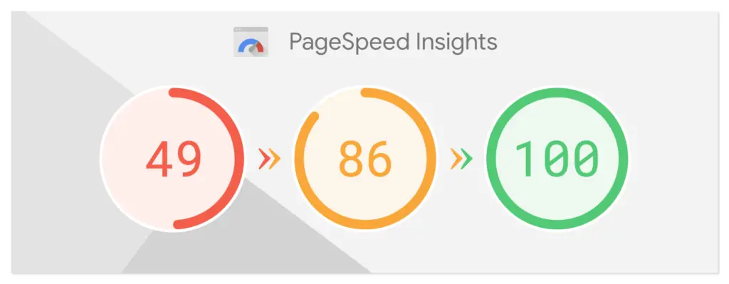
- Mobile Page Speed: Mobile site speed is crucial. Use tools like Googles search engines PageSpeed Insights to identify and address speed issues on your mobile pages.
- Mobile Friendly Content: Create mobile user friendly content thats easy to read and navigate on small screens. create mobile friendly content Opt for shorter paragraphs, clear headings and bullet points for better readability and mobile friendly mobile search in dynamic serving sites or websites mobile version .
- Structured Data: Implement structured data to help search engines understand your content better and display it more prominently in mobile SERP.
- Local SEO: Optimize your mobile site for local search. if your business has a physical location. Include relevant local keywords for local search and ensure your Google My Business listing is up-to-date.
Considerations
- Meta Descriptions: Craft compelling meta descriptions specifically optimized for mobile SERP, keeping meta descriptions character limitations in mind.
- Mobile Usability: Test your websites usability on various mobile devices to identify and fix any navigation or functionality issues that might hinder the mobile experience.
- Voice Search: Voice search is gaining traction. Consider mobile seo important voice search strategies that target voice search long tail keywords and conversational language. Stay ahead of the curve by familiarizing yourself with the latest voice search mobile SEO trends, such as the increasing importance of voice search and accelerated mobile pages (AMP).
By following these mobile SEO best practices, you can ensure your website is mobile-friendly, provides a superior user experience for mobile searchers and achieves higher rankings in mobile SERPs.
Remember in todays mobile first world, a strong mobile SEO strategy is the key to reaching your target audience and driving business success.
FAQ’s about Mobile SEO
How often should I update my mobile SEO strategy?
Mobile SEO is constantly evolving as user behavior and search engine algorithms change. It’s essential to stay up-to-date on the latest trends and best practices.
What tools can help me with mobile SEO?
- Google Search Console
- Mobile SEO checker tools (many available online)
- Analytics tools to track mobile traffic and user behavior to improve Mobile SEO
My Suggestion :
prioritizing these five mobile SEO techniques will help you attract organic mobile search traffic. The mobile experience is now many users’ main focus. In my 4+ Years of Experience As a SEO Expert . We Must have to Adopt Ourself with New Updates to Shine onine in 2024.. This is my Personal Suggestion For you..
Making your website mobile-friendly, fastloading and contentrich will boost your search ranking and give users a pleasant experience that keeps them coming back. As a SEO expert.. I recommend keeping up with mobile SEO trends and mobile SEO best practices.
Google constantly updates its algorithms. so what works today may not work tomorrow in mobile SEO.Monitor your mobile SEO performance and adjust your strategy to keep your website mobile-first and future-proof.

[ Disclaimer : This blog post provides information only. Search engine algorithms change, but we try to provide accurate mobile SEO advice. Today’s solutions may not work tomorrow.. So Please Follow our Blog Section for latest Updates Related to mobile SEO. Thank you. ]
We are Doing Ethical SEO Services For Our Clients. Dont worry about your Websites mobile SEO..
I will Do mobile SEO Service For you. Reach me By Clicking Whatsapp Us Button Above in Menu Bar. Thank you by Siddarth parthiban Your SEO Expert.
As a mobile SEO freelancer.. I can boost your websites search mobile SEO ranking over time. This increases organic mobile SEO traffic, leads and sales for your business.
Follow me to get fresh updated about SEO and Bloging. I Update Articles Frequently. This Article First time Published on March 31, 2024 @ 9:42 pm

Hey Guys I am Siddarth Parthiban SEO Expert From 11 Shivan kovil Road, Thiruvannamalai, Tamil Nadu 606704, India.. Doing Services for Client from 2019. I Completed 190+ Successful Projects for my Happiest Clients.. 4+ Years Of Hands on Experience As a SEO Expert alias Google Web Master.
